
Packaging & Print

Customer Sample Box
I concepted and designed a customer-facing branded Sample Box aimed at cross-selling facility and cleaning products to our top 100 customers who were not previously purchasing in those categories. The box was thoughtfully designed to showcase product value, encourage discovery, and create a cohesive branded experience that felt personal and intentional rather than promotional. By strategically curating and presenting the samples, the initiative successfully drove new category adoption—resulting in captured sales from 87% of the customers who received the Sample Box.
Client
Quill Sales & Merchant Teams
Year
08/2025

Executive Video Mailer
I led the concepting and design of a 6×9 video mailer created for the Sales VP and team to engage top client prospects. The piece was designed as a cohesive branded experience, pairing print design with two custom-produced videos. I art directed the “About Quill” video by developing detailed storyboards to guide motion production and ensure visual clarity and consistency, and I designed and filmed a direct, on-camera message from the Sales VP for prospect CEOs and executives. Together, the print and motion elements formed a high-impact, design-driven touchpoint aimed at senior decision-makers.
Client
Quill Business Development Team
Year
04/2025
Small Business Kit

For this project, I led a brand initiative to promote Quill at the Small Business Expo hosted at the University of Chicago, an event with thousands of attendees. From concept through execution, I designed and produced a branded business kit that introduced small business owners to who Quill is and how we support and care for their needs. The kits were thoughtfully designed to feel approachable, useful, and on-brand, and were distributed to over 250 small business owners at the event. I owned the project end-to-end—from ideation and design to assembly and final product hand-off on site, making this a large-scale brand initiative I’m especially proud to have delivered.
Client
Quill Brand Team
Year
06/2025
Event Recap Video

Paper Carton Designs
This project explores how thoughtful design can transform disposable packaging into a reusable object. The original brief requested one design to feature a color-by-number concept incorporating Sharpie’s new creative markers, which led me to develop three visually engaging 8-ream paper carton boxes. Each design encourages customers to keep the box rather than discard it. The cartons seamlessly transition into storage solutions, promoting recycling through reuse and elevating an often-overlooked everyday product.
Client
Quill Merchandising Team
Year
08/2025
T-Shirt Designs
-
![BCA | QUILL SHIRT]()
2026 Design
BCA DONOR CONCEPT
-
![BCA | QUILL TSHIRT]()
2026 Design
BCA DONOR PRINTED FINAL
-
![BCA | QUILL CONCEPT DESIGN]()
2026 Design
BCA DONOR CONCEPT
-
![]()
2026 Design
FINAL DESIGN
BRING YOUR KID TO WORK DAY -
![]()
2026 Design
5K FINAL PRINTED DESIGN
-
![]()
2026 Design
5K ALTERNATE CONCEPT
-
![]()
2026 Design
5K ALTERNATE CONCEPT
-
![]()
2025 Design
5K FINAL PRINTED DESIGN
-
![]()
2025 Design
5K ALTERNATE CONCEPT
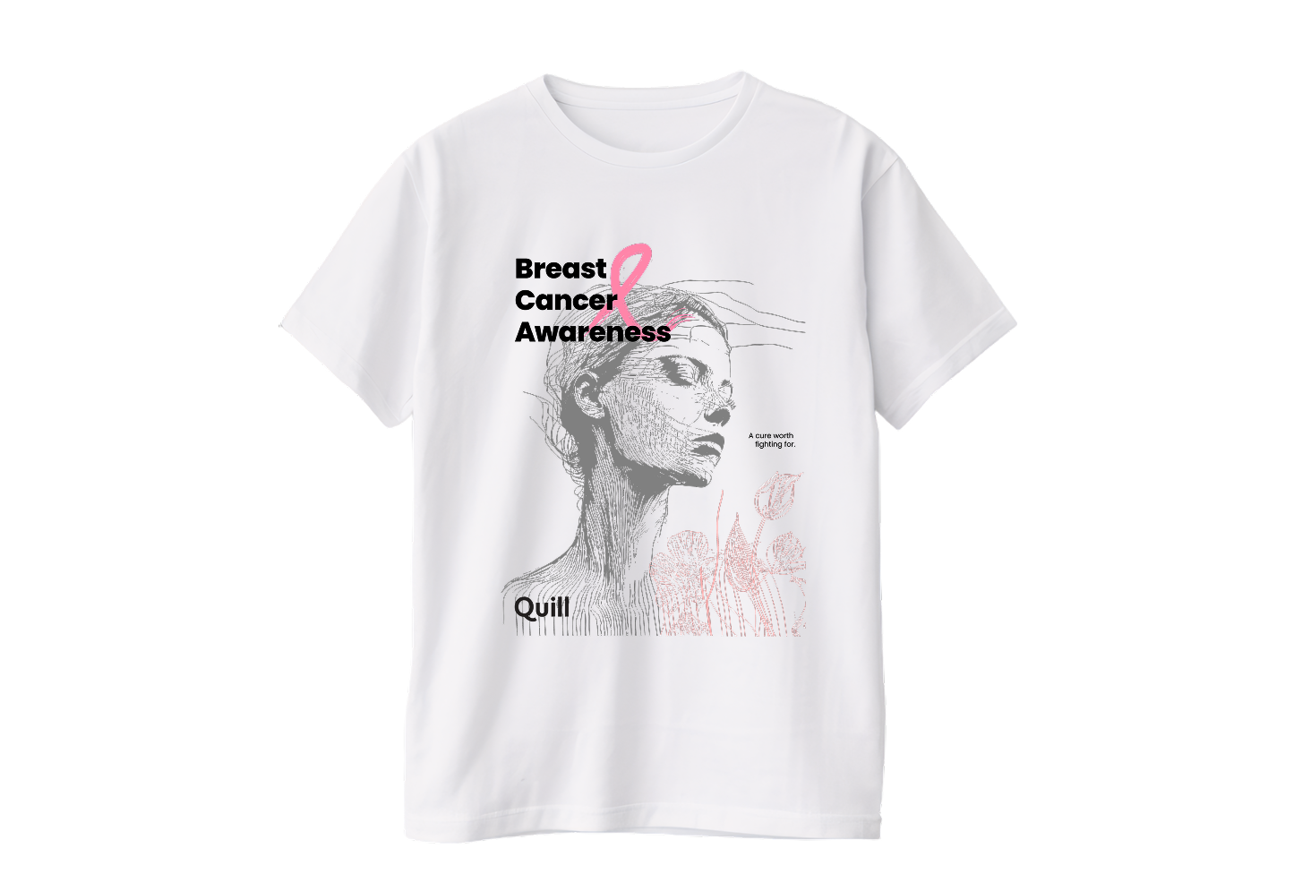
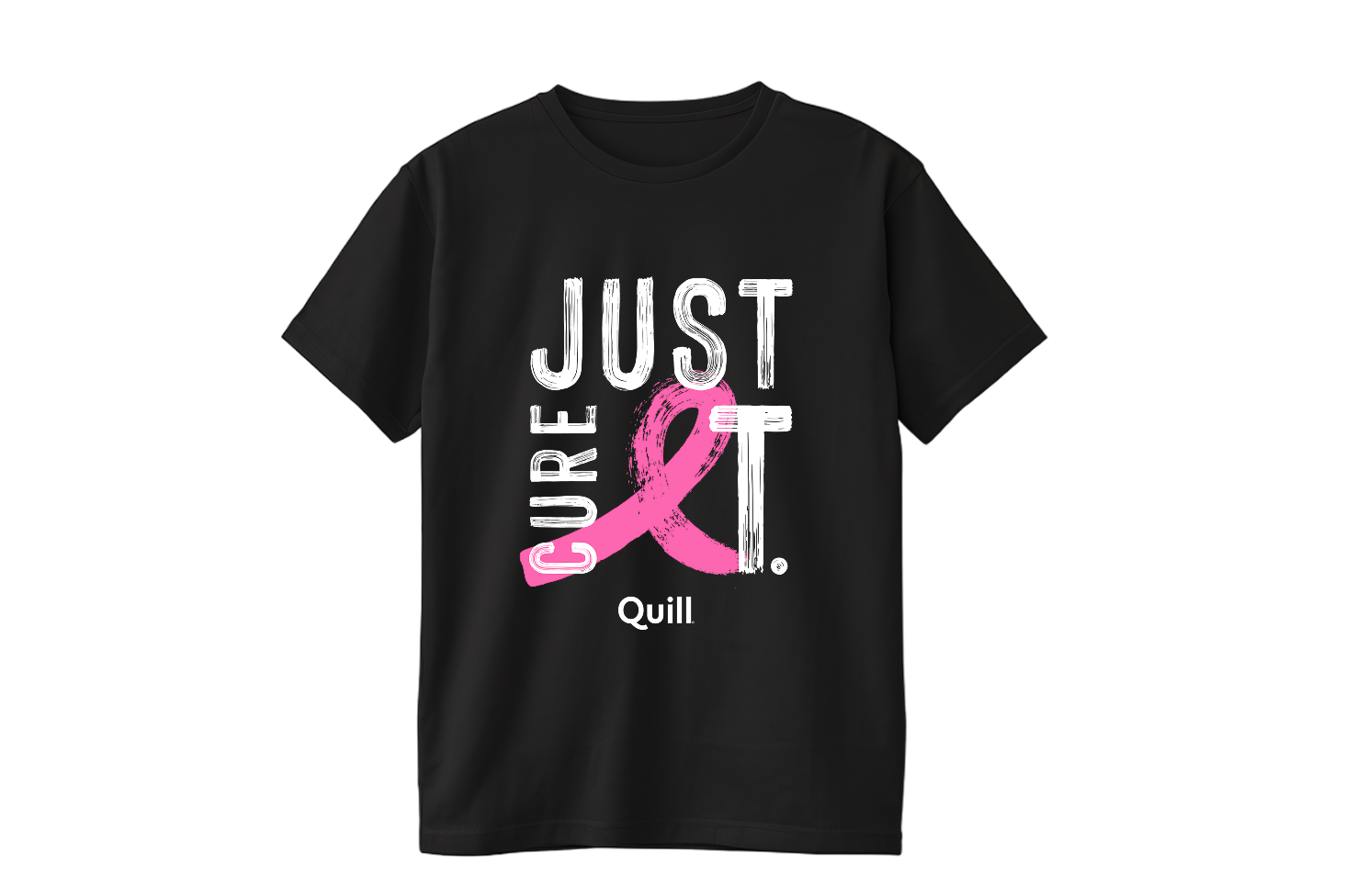
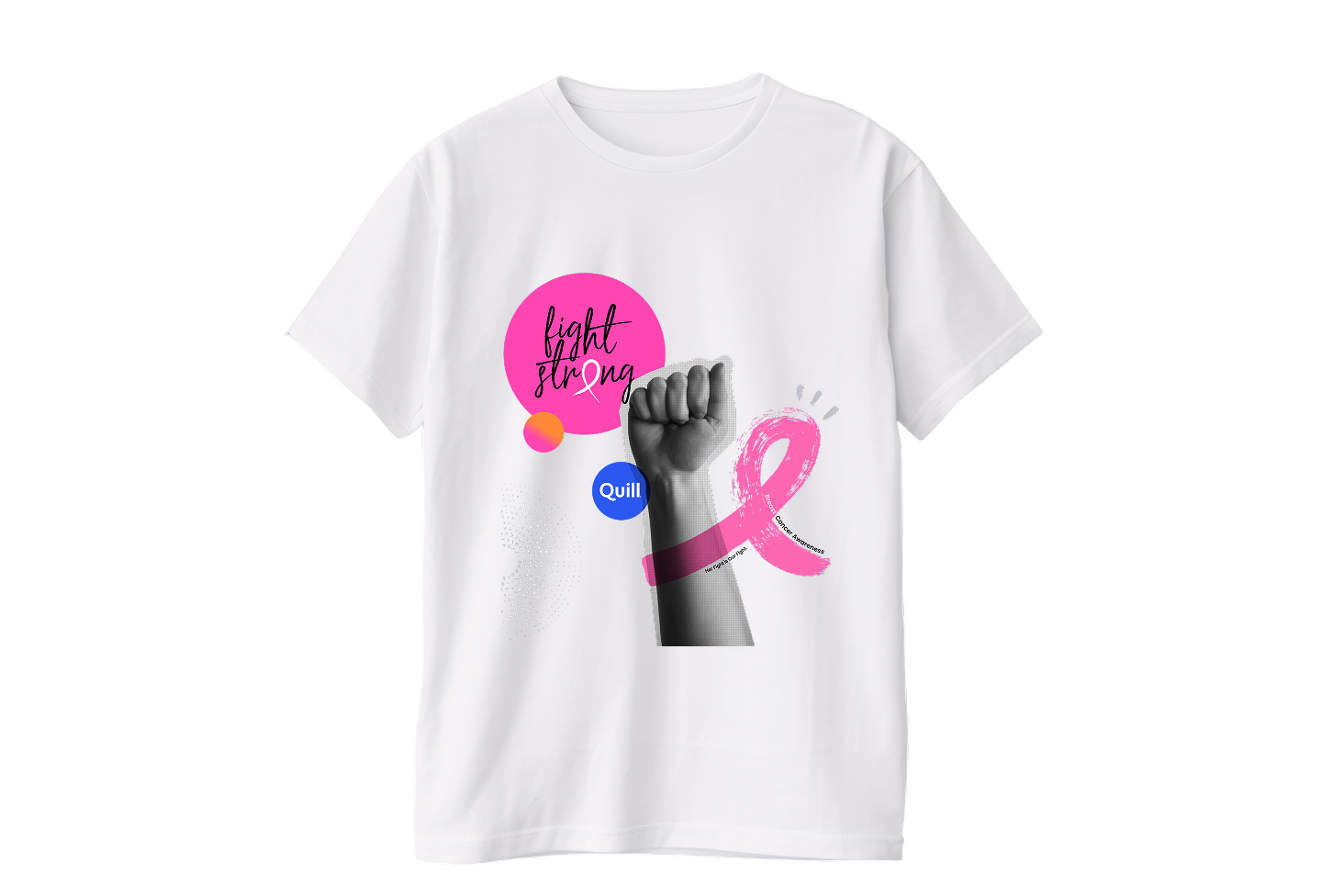


For our 2026 Breast Cancer Awareness campaign, I challenged myself to create designs that felt less like traditional awareness merchandise and more like purposeful, wearable graphic art. I developed three distinct visual directions, including two original concepts with no direct equivalent in the marketplace. “A Cure Worth Fighting For” explores strength through softness, pairing a hand-drawn portrait with delicate florals and the pink ribbon. “Fight Strong” takes the opposite approach, using bold color, expressive artwork, and a sense of movement to turn solidarity into a visual statement. The selected “Just Cure It” concept taps into a familiar phrase within the BCA community, transforming it into a bold, accessible design with broad appeal. Together, the concepts demonstrate how thoughtful visual storytelling can elevate a cause-driven message while creating merchandise people genuinely want to wear.
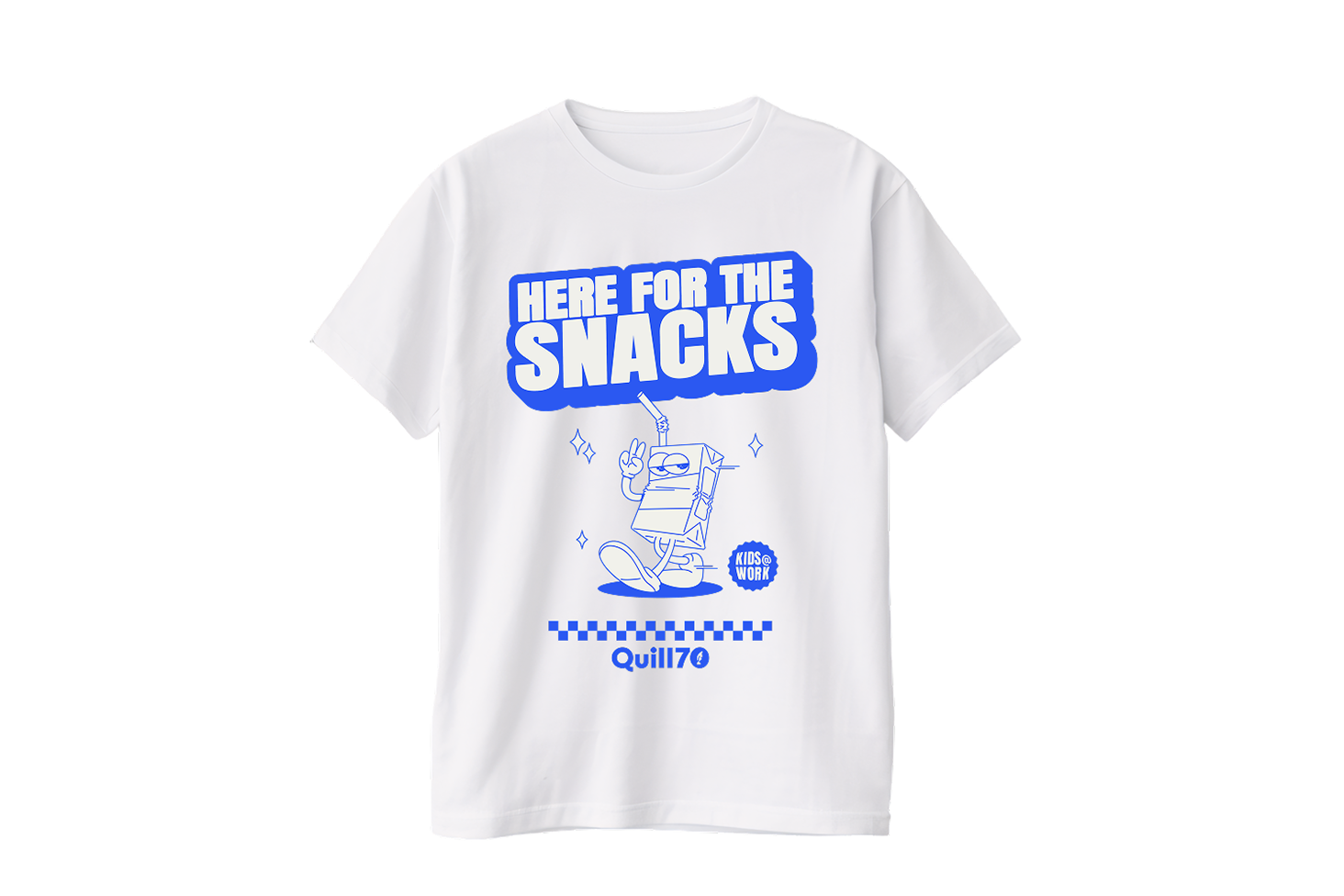
For the Kids@Work event, I looked beyond the traditional “bring your kids to work” visual language and focused on one of the day’s most universal experiences—snack testing. Turning that shared moment into the creative centerpiece allowed the design to feel playful and authentic while capturing the curiosity and energy of the day. The concept became both a memorable visual identity for the event and an opportunity to incorporate Quill’s 70th anniversary into the experience in a way that felt natural rather than forced.
For our annual Company 5K, I treat the t-shirt as more than event merchandise—it’s an opportunity to turn a cultural moment, brand story, or shared interest into something employees genuinely want to wear. In 2025, I tapped into 90s nostalgia and MTV’s cultural legacy, creating a tongue-in-cheek tribute that connected with Gen X and Millennial audiences. In 2026, I expanded the creative territory across several distinct directions: celebrating the Artemis II mission, reviving Quill’s 70s-era identity through a retro-inspired concept paired with a FIFA 2026–influenced “5K is life” theme, and embracing a more unexpected Bigfoot-alien conspiracy concept purely for fun. Across each direction, I focused on finding the intersection of cultural relevance, brand storytelling, and personality—creating designs that give employees another reason to engage with the event and the brand.